The 4 iOS 11 Features You'll Hate Immediately
But they will probably grow on you.

At first glance, iOS 11 seems like change for the sake of it. The software update was released for iPhone, iPad and iPod touch on Tuesday, and early adopters may find a number of unexpected tweaks to daily device tasks.
Apple has a habit of throwing away cherished features in the name of progress. iOS 6, released in 2012, dropped Google Maps in favor of Apple’s own solution, adding turn-by-turn directions but causing gripes for users familiar with the old approach. iOS 7, released the following year, introduced a radical redesign that ditched the more ornate elements of the user interface in favor of a flat, sparse approach.
iOS 11 isn’t quite as radical as either of these, but there are a few things you’ll need to get used to. Here’s the four you need to know about:
4. Control Center Redesign
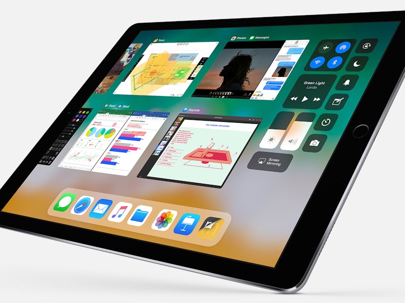
Not content with the tidy approach favored by iOS 11, the new Control Center (the panel accessed by swiping up from the bottom of the screen) takes up the whole screen:
Old Control Center vs new.
The rationale is that users can now add extra buttons into the mix if they want shortcuts to, say the Voice memos app, but that doesn’t mean it’s not a difficult one to re-learn. Years of muscle memory are now thrown aside in a change that’s probably for the best in the long term, but will take some time to get used to.
3. Notifications Redesign
This one is going to be hard to get your head around. The notifications panel, pulled down from the top of the screen with a swipe, has been altered to more resemble the lock screen. In fact, it’s quite hard to tell whether you need to press the home button to continue, or to do something else.
Hmm...
The change is baffling, a bit confusing, but ultimately it’s a screen we’re all used to so it’s not like there’s too much to learn here.
2. Dock Labels
Better get learning those app names. iOS 11, for some reason, hides the names of the apps located in the dock along the bottom of the home screen. Chances are you already know what they are, owing to the fact that you probably put them there because you use them a lot, but if you don’t you might need to rethink your home screen’s layout.
1. Signal Bars
The bars to show signal strength, which were dropped in iOS 7 in place of dots, have returned. This makes it slightly more difficult to see at-a-glance how much signal you have before losing service entirely.
The new bars.
It’s only really a change that makes sense on the iPhone X, where space is limited by the “notch” that takes up the top center of the display. Unfortunately, as Apple sees the new design as the future of its smartphone line, this is unlikely to change. You’d better learn to squint.