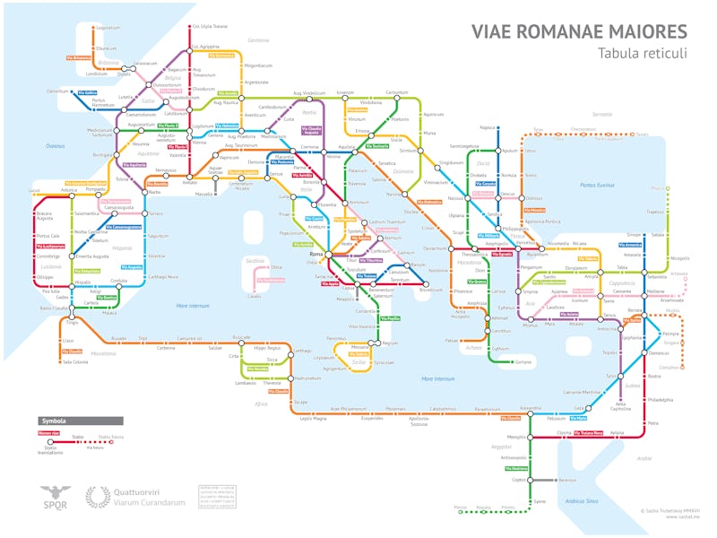
This Cartographer Turned Roman Roads Into a Modern Subway Map

The Roman Empire didn’t have a subway map — or subways, for that matter. But it did have extensive roads: 55,000 miles of them, built over 700 years, stretching from Petra, Jordan, to London, England.
Now, thanks to the work of college student and cartographer Alexandr “Sasha” Trubetskoy, not only do all roads lead to Rome, all subway routes do, too.
Trubetskoy’s map — view the high-resolution version here — which he released to the world this month on his website, takes the roads of the Roman Empire and organizes them into the clean, colorful style of a subway map. The final product provides a quick overview of the empire, which for hundreds of years dominated Europe, and even parts of Africa and the Middle East.
While the Romans clearly got around, Trubetskoy’s map shows that some areas were more trafficked than others. Like Midtown Manhattan on the modern MTA map of New York City’s subways, Italy’s boot was rife with transportation options. Modern day France, Spain, Greece, and Turkey also seemed popular.
But Morocco, Sardinia, Italy, England, and other less developed regions end up looking like New York’s forgotten fifth borough, Staten Island, which has one literal subway line, leading to nowhere in particular.
The Roman Empire's subway map.
The map doesn’t only provide a comprehensive look at Roman routes, however. It also includes many smaller details that only ancient history enthusiasts can be expected to totally comprehend.
The bottom left of the map, for example, has an image of an eagle and the letters “SPQR.” That meant it belonged to “the Roman Senate and People,” and the four letters are still scattered throughout Roman infrastructure to this day. The map also carries the mark “Quattuorviri Viarum Curandarum,” a reminder that the roads were under the purview of four magistrates dedicated to road maintenance. And on the right side of the map, Trubetskoy placed his characteristic maker’s mark with his name and website — with a slight twist. Instead of noting the map was made in 2017, he wrote the year in Roman numerals: MMXVII.
A more true-to-life representation of the extent of the Roman Empire.
While the map is carefully made, it highlights the reductionism and false order inherent to all subway maps. Instead of winding reality, we get an over-corrected impression of what the empire really looked like from the ground.
It’s also limited by the fundamental differences between the way people walk (or ride on horseback) and the way subway systems are designed, as Trubetskoy writes in a blog post about his cartographic endeavor. “Obviously to travel from Petra to Gaza you would take a more or less direct road, rather than going to Damascus and ‘transferring’ to the Via Maris,” he wrote. “The way we travel on roads is very different from rail, which is a slight flaw in the concept of the map. But I think it’s still aesthetically pleasing and informative.”
The only question now is, where’s Hyperloop team SPQR?