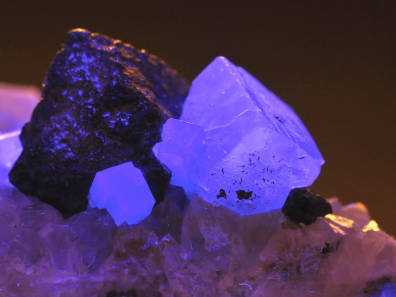
Ultra Violet is Pantone's Futuristic Color for 2018
The science behind this cosmic purple shade.

Be prepared to see the color purple — or, more precise, “ultra violet” — everywhere next year, because Pantone’s Color Institute has just made its annual announcement unveiling the color of the year, and for 2018 they’ve chosen a “blue-based purple that takes our awareness and potential to a higher level.”
According to Pantone’s press release, ultra violet aims to inspire:
“Ultra violet suggests the mysteries of the cosmos, the intrigue of what lies ahead, and the discoveries beyond where we are now. The vast and limitless night sky is symbolic of what is possible and continues to inspire the desire to pursue a world beyond our own.”
Different shades and uses of the Pantone 2018 Color of the Year.
If all of that sounds a bit — well, out there — you can take some comfort in the color’s scientific and historical basis. The word (or words, as Pantone chose to spell it), has Latin roots: “ultra” means beyond, and violet comes from the word “viola”, for the violet flower. Violet is also the color of the highest frequencies of visible light, and “ultraviolet” implies a higher frequency than visible light.
Meanwhile, ultraviolet light is what we call the electromagnetic radiation that makes up 10 percent of the sun’s rays. It’s invisible to the human eye, though we can see its effects, in the shade of self-tanners turned orange after overexposure to its rays or ghostly white under a black-light.
In this NASA handout, the moon transits across the Sun, as seen in 304 angstrom extreme ultraviolet light during the total eclipse on August 21, 2017.
Because ultraviolet refers to things that the naked eye cannot see, it’s perhaps no surprise that Pantone has taken its potential impact one step further by pegging it to higher consciousnesss. The company has been elevating normal colors to zeitgeisty status since 2000, with past winners including “honeysuckle,” “marsala,” “sand dollar,” and (last year’s) [“greenery.”)[https://www.pantone.com/press-release-pantone-unveils-color-of-the-year-2017-pantone-15-0343-greenery] Leatrice Eiseman, Pantone’s Executive Director, said that greenery “represented the reassurance we yearn for amid a tumultuous social and political environment.”
So if Pantone’s predictions are any guide, we should be thankful for the higher consciousness that awaits us all.