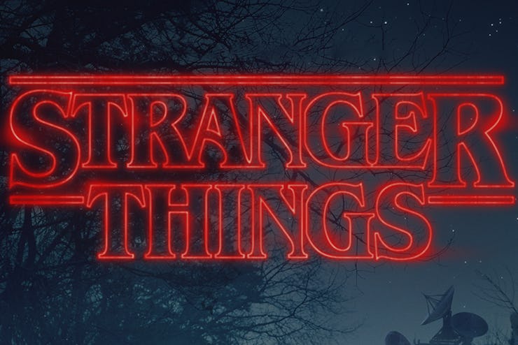
That 'Stranger Things' Font: Same as 'Star Trek' and Stephen King
Why does this particular typeset recall a specific period in science fiction?

If you binged the retro-chic Netflix sci-fi series Stranger Things this weekend, you probably felt a rush of nostalgic familiarity. The series pays to homage to a Spielberg/King sci-fi aesthetic, while also bringing back our favorite 1990s It Girl, Winona Ryder. At a tidy eight-episodes, the series is also manageable for those feeling overwhelmed with TV choices.
But, all of that is secondary to the most sneakily retro component of Stranger Things: the title font.
That’s right, you probably like this show because you enjoy stories about monsters from other dimensions, but you may have been drawn in by the way the actual typeface is shaped. Reminiscent of a Stephen King paperback, the font used for the title sequences of Stranger Things is called ITC Benguiat. As its inter-locking letters float-into view, you are psychologically being primed to think about decades-old science fiction. Not only does this specific font — released by the International Typeface Corporation in 1978 — have a long sci-fi history, its creator has classic phantasmagorical influences with other fonts, too.
The same font was used in the title sequences in for the Star Trek movies in the ‘90s. Specifically: Star Trek Generations, Star Trek: First Contact and Star Trek: Insurrection. Just like in Stranger Things, those fonts floated into view, seemingly from just outside the frame, before having little lines shoot off the sides of them.
The font ITC Benguiat was created by Ed Benguiat, a designer now considered the father of over 600 typefaces. ITC Benguiat is notable not only for its use in those Star Trek films, but also as the scary message which told you not to pirate our Paramount Home Videos when we were kids:
In addition to designing ITC Benguiat, Ed Benguiat is also responsible for two-other titles which would interest fans of Stranger Things; the original Planet of the Apes, and, fittingly, Twin Peaks.
There’s a fair amount of thought put into fonts and typefaces in terms of how and why they’re selected and what the psychology of all that means. With ITC Benguiat, the psychological reaction from a certain kind of science fiction person is clear: there’s a certain amount of prestige we’re already associating with these words. To put it another way, we already like what you’re giving to us! Keep it coming.
Here’s the title sequence in full: